
There have been a lot of exciting cultural movements in recent years for diversity and inclusion, but there seems to be an underlying expectation that these movements are just trends. So, brands are a little slow on the uptake, especially when it comes to their online presence.
Riding this wave is the idea that website accessibility is slowly becoming an expectation for organizations in government and other highly-regulated industries, like healthcare and finance. As it should be, right?!
But here's the thing, website accessible design is just good design and it shouldn't be confined to just highly-regulated industries. Every website should follow the basic principles of website accessible design, because why the hell wouldn't you?
Right about now, you might be saying "Eileen, I the hell wouldn't because it's a lot of work to make specific changes to my website for a small percentage of my website visitors".
My answer to that is A) Cite your source, and B) It's definitely not as hard as you'd think.
We'll walk through the five most basic things you should be doing to make your website accessible in this post and then you'll be out of excuses. I've also included some helpful tools that will make accessible design that much easier.
The 5 Most Basic Things You Should be Doing To Make Your Website Accessible
- Color Usage
Seriously, when I said basic, I meant basic. How you use your brand's colors on the web is a super easy way to make your site accessible for people who have visual impairments, which include trouble seeing or color blindness.
What you want to do is run your brand color palette through one of them following tools that will basically map out what color combinations are tough to read and don't follow WCAG standards. Like, they will literally tell you what to do.
Here's an example from a client, Apicha Community Health Center's, color palette: Some color palette's are just naturally made to be accessible, the colors are very different and mix well, but Apicha CHC's palette, while perfect for creating a beautiful brand, is not perfect for web accessibility. Let's try a few combinations and see what's off limits.
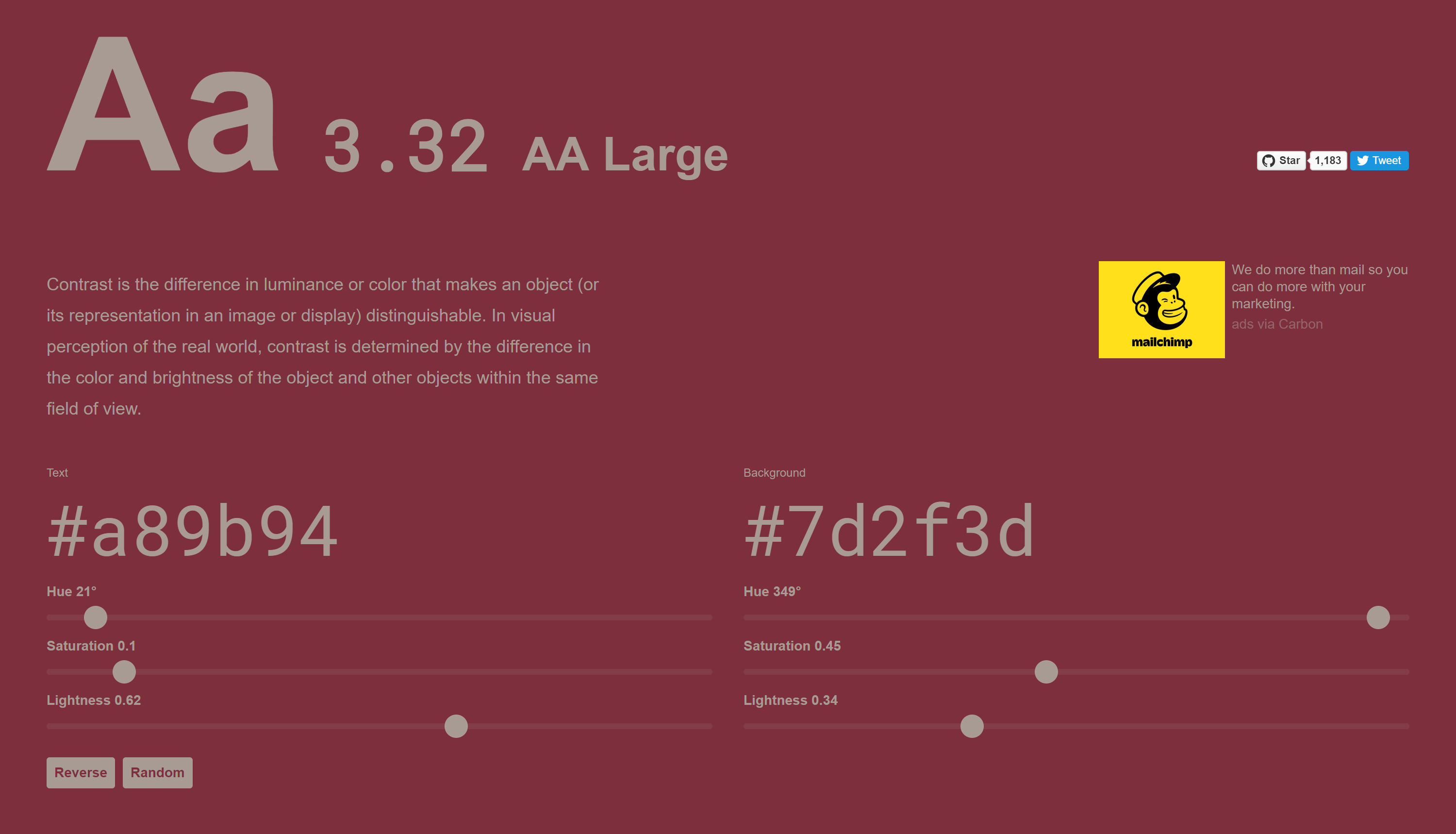
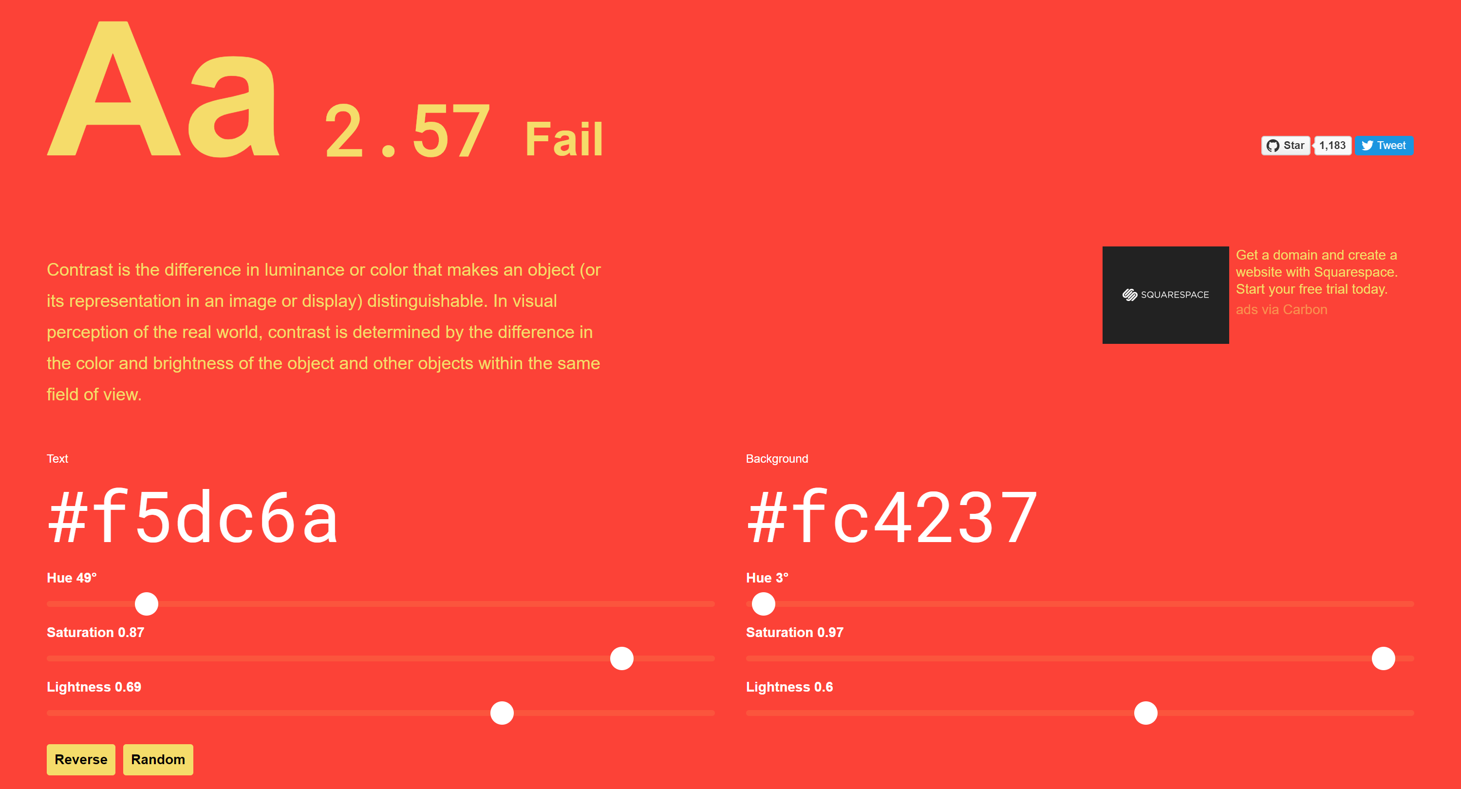
As you can see, the red and yellow combination is off limits, as is the maroon and red combination. However the maroon and grey combination doesn't outright fail, but there is the caveat that the grey text must be "Large" if you're going to use it, which brings us to our next point. - Font Size
The size of your font can go far with increasing readability for those with visual impairments. Font size goes hand-in-hand with color contrast and there are a lot of specifications regarding contrast ratios, but here's the thing -- you don't need to know all that stuff. The tools will tell you what you need to do.
So for our grey font on a maroon background example, the contrast ratio equals out to 3.32, so our font size has to be 'Large' to be accessible, which, according to WCAG guidelines, is 18pt or larger.
For something with a much higher contrast ratio, like white text on my maroon background, the contrast ratio equals out to 8.95, more than double the grey on maroon, and so my font size could basically be anything.
For situations like this, my personal best practice is to use a minimum font size of 16pt for body text. It's plenty big and actually covers a lot of bases for more questionable contrast ratio situations. But that is larger than you may used to be using, so if that just looks weird to you, the 14pt-15pt range is okay in high-contrast situations as well, although I wouldn't go lower than 13pt if you want grandma to be able to read your website. - Link Styling
I am not a fan of underlined text, just in general, but especially in web design. It just looks busy, messy, and doesn't carry any inherit meaning like italics or bold. I used to say underlined text links were hideous.
But I've since had to eat my words, because for those who have visual impairments, it's super helpful for text links to have something to call them out, besides just being a different color. Underlining your text links and using your 'click color' helps everyone, even those who aren't visually impaired, know that that's clickable text.
To make myself feel better about underlining text links, I like to remove the underline on hover state, which (in my humble opinion), makes the link look FUN, dynamic, and inviting (tinder profile anyone?). - Use ARIAs
The ARIA's full name is WIA-ARIA (I would go by my nickname too), and stands for Web Accessibility Initiative – Accessible Rich Internet Applications. The purpose of ARIA attributes are to provide some visually-hidden context for our HTML elements for screen-readers. ARIAs come in a few common formats and are fairly easy to adopt as a habit when you're coding HTML sections for your site.
- ARIA roles tend to be the most commonly used ARIA attribute, and they are intended to function exactly how they sounds -- to inform screen-readers about the function of an HTML element. For example, appropriate usage of an ARIA role might be to describe the primary navigation of your site:
<div class="nav" role="navigation"><a></a><a></a></div>Note that we wouldn't use a role attribute if our navigation was encompassed in<nav></nav>tags, because the HTML is natively describing the element. Also notice that we didn't add the ARIA role to the nav items themselves, but to their parent element.
Best practice is that any HTML element on your site that the website visitor can interact with should have a descriptive attribute or role. - ARIA labels are designed to explain the purpose of your HTML elements for screen-readers or people/bots that can't read the text on the screen and don't have text HTML attributes. The key there is that you shouldn't replace an inherit HTML descriptor attribute with an ARIA, and ARIAs shouldn't get in the way of your code.
An example use case for an ARIA label would be to distinguish multiple HTML elements, likerole="navigation" aria-label="primary"androle="navigation" aria-label="secondary".
You can also use ARIA labels to differentiate regions of your page. For example, if you have a sidebar on your blog, you could putrole="sidebar" aria-label="Recent Posts".
You'll typically only want to use an individual label only once per page, so if you're finding that several of your elements have the same label, double check that you're being descriptive enough. - ARIA hidden attributes are often used to tell screen-readers when an HTML attribute is just for show and doesn't offer any information or interactivity. An HTML attribute that you might want to hide would be a Font Awesome icon. Even if the icon is linked, as long it's not the only element that provides that link, you'll want to hide it.
123.456.7890<i class="fa fa-phone-square" aria-hidden="true"></i>
It's especially important to hide your icons if possible, because the<i></i>tag is also sometimes used to mean that the text is italicized (which is not a best practice anymore, BTW) and could confuse screen-readers.
- ARIA roles tend to be the most commonly used ARIA attribute, and they are intended to function exactly how they sounds -- to inform screen-readers about the function of an HTML element. For example, appropriate usage of an ARIA role might be to describe the primary navigation of your site:
- Bypass Blocks
This one actually requires some work, so I apologize in advance, but it's about as basic as pumpkin spice when it comes to accessible web design.
Bypass blocks are 'hidden' anchor links that screen-readers can use to jump past large sections of functional text, like your site navigation.
Imagine for a second that you had to sit there and listen to a screen reader read off every...single...link... in your site's navigation before getting to the actual content on your page. Sounds painful right? Makes you want to delete all your navigation links, right?
Don't do that, that would be bad. But what you should do is drop an anchor link at the top of the body of each page that links to the meat of the page, bypassing (get it...) your 12+ navigation links if the website visitor so chooses.
If you're using a CMS like HubSpot to host your site, I would just add the anchor tag in your global module above the header navigation and then drop the destination below the header and hit update to carry it across to all your pages.
Then, use all the time you saved there to go through each one of your pages and look for other, similar blocks that might benefit from a bypass. - BONUS TIP
As one of our readers kindly reminded me in the comments, alt text for images is super important for screen readers (as well as SEO, so it's a two-for-one!).
Make sure you're implementing this Tweet-tip from Ricky Onsman to format your alt text!
Did you know adding a full stop (period) after alt text makes screen readers pause before announcing the next thing on a web page? You do now. It's just like when you read with your eyes: punctuation matters. #a11y
— Ricky Onsman (@onsman) November 4, 2018
The Best Basic Website Accessibility Tools
First of all, I'll clarify that basic doesn't necessarily mean bad. This is coming from someone who dressed as a Basic Bitch for Halloween one year in college. These tools offer basic functionality you can utilize to help make your website accessible.
Accessible Color Usage Tools
- Colorable - This tool is super simple to use and gives you the info you need to make accessible color usage choices. The screenshots above are from this tool, and it is literally just that one page. Super functional with no fluff.
- Material Design's Color Tool - The entire suite of Material Design tools are some of my favorites, and the color tool is a big reason why. If you're needing a color palette for a Material Design project, you can start with their palette, or you can put in your own custom colors.
This tool is a little bit fancier in that it includes the minimum opacity that your background color can be for the contrast ratio to maintain intact, as well as one color value above and below each color you pick to help you build your Material Design palette.
Once you've got your palette ironed out, you can get a shareable link in the a style guide-esque format that shows example usage mock-ups. You can also export to iOS, Android, or Codepen. Even if you're not utilizing Material Design in your project, I would still recommend double-checking the accessibility of your color usage with this tool.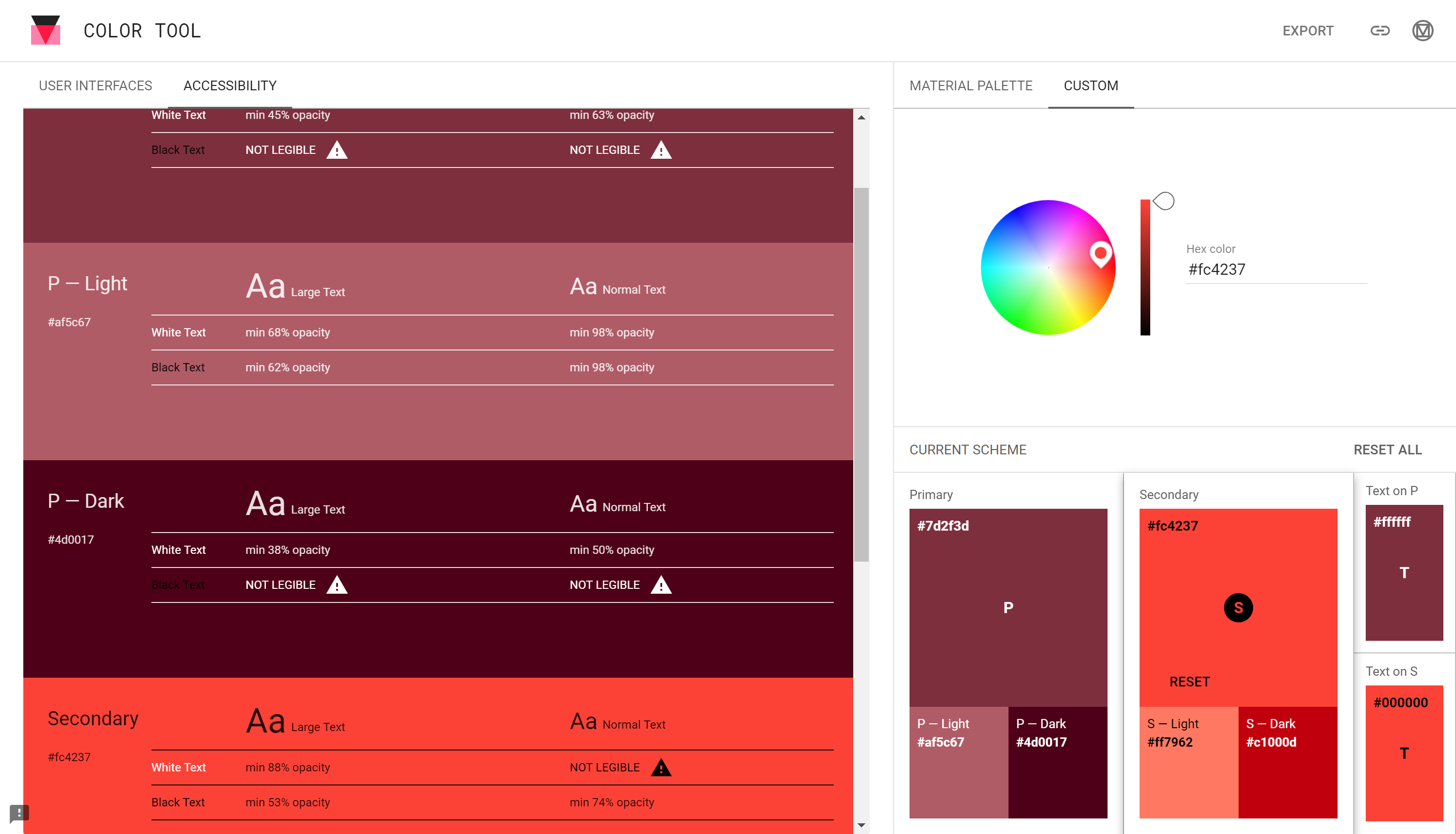
Material Design also offers an alternative icon set to Font Awesome icons that follow more of the Material Design style, and they're just as easy to use, if not easier. - The SiteImprove Accessibility Checker Chrome Extension
If you've been following along, this Chrome extension shouldn't be new to you, as I featured it in my Best Chrome Extensions Ever series. But if you're new here, or you are better at controlling your Chrome extension self-control than I am and haven't downloaded it yet, do it NOW.
This Chrome extension will scrape a webpage and alert you to any WCAG infringements, like color contrast ratio issues, and even give you pointers on how to fix them. - The W3C website
There is a lot of fragmented information out there regarding website accessibility, and since there are three levels of compliance that are frequently updated, it's super difficult to find one set of clear rules to follow.
This website, when used in conjunction with the SiteImprove Chrome extension to identify infractions, allows you to search those alerts, investigate how to fix them, and keep them from happening again.
As a parting gift, I leave you with the three levels of WCAG 2.0 (Web Content Accessibility Guidelines) conformance:
- A Conformance - Level A is the minimum level of conformance in WCAG 2. For Level A conformance, the Web page satisfies all the Level A Success Criteria, or a conforming alternate version is provided.
- AA Conformance - Level AA is the medium level of conformance in WCAG 2. For Level AA conformance, the Web page satisfies all the Level A and Level AA Success Criteria, or a Level AA conforming alternate version is provided.
- AAA Conformance - Level AAA is the highest level of conformance in WCAG 2. For Level AAA conformance, the Web page satisfies all the Level A, Level AA and Level AAA Success Criteria, or a Level AAA conforming alternate version is provided. It is not recommended that Level AAA conformance be required as a general policy for entire sites because it is not possible to satisfy all Level AAA Success Criteria for some content
Did I miss any *basic* things you should do for website accessibility? Are there any tools you would like to recommend for the roster? Let me know in the comments!