Disclaimer: This is not a post all about how to "block popups".
Despite the fact that Google records 2300 searches a month of some version of "how to block popups", they still tend to convert pretty well. This group of studies done in 2014 saw popups increase conversions by an average of 1000%. So yes, we, as consumers, hate them. But obviously not enough to ignore them and not fill them out.
We recently had a client ask for us to add popover images to a site page about Pope Francis' Apostolic Journey to America in 2015. They request was not necessarily driven out of need as much as aesthetic reasons, but I was eager to jump on this project for the functionality that the popover offer.
Catch me up, what is a jQuery modal?
A modal, a modal window, a modal dialogue window, or a jQuery modal, is the generalized term for a popup. Technically, a modal is defined as: "...Any type of window that is a child (secondary window) to a parent window and usurps the parent's control" (Webopedia.com).
So basically, it is any form of popup that is controlled by the website that you are on. We're not talking about those super-sketchy windows that opened another browser window that were very circa mid-2000's and offered thousands of dollars worth of electronics in exchange for your email address either. We're talking about these popups:
Timed popups
The ones that you typically encounter as you are browsing blog posts are the timed popups. These will usually pop up onto your screen after you have been on that page for a certain number of seconds.
Nowadays, these popups will usually encourage you to provide your email address to subscribe to that website's blog, or include a call-to-action to a content download landing page or conversion point.
Click-triggered popovers
This was the kind of popup that our client was looking for. They wanted a visitor to their page to be able to click on an image, and that event would in turn trigger a popover in a modal window. While this usage of this digital marketing method isn't as functional as it is aesthetic, it has the potential to be very functional as well.
For example, if you wanted someone to be able to sign up to your blog subscription on a full-size form without interrupting the flow of your web page or blog post, this version of a popover would be perfect. Simply provide them with a button CTA in the sidebar to 'Subscribe" that popups a form when they click. Easy peasy.
Except, maybe not so much. HubSpot was designed as a website and marketing automation tool for marketers, not developers, so you would think that creating popups would be pretty simple, since they are so widely used. Or not.
When I hit the Google pavement to scope out some good resources for the creation and implementation of this click-triggered jQuery modal, I didn't come up with a whole lot.
However, there were many different resources for timed popups, with a particularly great jQuery modal tutorial by the Sales Lion that included the necessary Javascript download and a step-by-step video.
So I did a bit of digging, a bit of hacking, and a bit of whining and swearing at HubSpot, and came up with my own version of an event-click jQuery modal.
How-to Create Multiple Image Popovers in HubSpot COS
Step 1: Set Up Your Javascript Code
You can find the necessary JavaScript code here, kindly provided by the HubSpot GitHub (love this site!). To set it up in HubSpot, you first need to upload it into your File Manager.
You then need to go to your site's Content Settings and find the Site Header HTML text box. You will then copy/paste the following chunk of code into your site's Site Header HTML:
<script
src="//cdn2.hubspot.net/hubfs/413799/Website_Assets_2016_nrmg/modal_PopUp.js"></script>
Then copy the URL of the js file in your File Manager. You will then replace the orange section of the aforementioned code above with the URL of your JavaScript file. Now your Javascript has been set up!
Step 2: Set Up Your CSS Code
This CSS has been pulled from this incredibly helpful article that I must attribute most of the success of this experiment to. He had almost everything that I needed, and I added a few other bits.
Repeat the steps above to create a new coded file. This time however, you will want to name your file something like PopUpModal.css or the equivalent, just so that HubSpot will know you are creating a CSS file. Copy and paste this CSS code into your new coded file and hit publish.
This CSS is set up for four different popover modals, but you may need to come back to this file to edit depending on how many popovers you need to create, so don't lose it forever in the black hole of the HubSpot Design Manager.
Step 3: Set Up Your Page
Now that your back-end set up is well on its way, it's time to set up your page template. Back to the Design Manager you go.
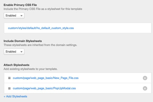
First, make sure that your new CSS file, PopUpModal.css or whatever you called it, is connected to this new page template. You can do this by going to your page template, hitting the Edit drop down in the top left hand corner, and clicking Edit Head.
It will then give you a popup that looks like the screenshot below with an option to "Add Stylesheets". Click the dropdown to find your new CSS file, click to choose, and then hit add.
 Adding the Custom HTML Modules
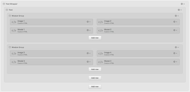
You will want to set up two Custom HTML modules for every one click-triggered modal you need. For example, I needed four different popovers, so I created eight Custom HTML modules. For neatness, I have laid them out in a grid pattern and grouped them together, but this is not necessary for the functionality of the popover.
The HTML code for the click-trigger
You will put this code in your first Custom HTML module. This is the code that you need to develop the piece of the popover that you want people to click on. In this example, this is an image, but it can also be text. The trick for creating multiple popovers is that the HTML code for each trigger needs to be given a different name.
However, the base HTML is this:
<a href="#" data-reveal-id="myModal">Click on this to launch the modal</a>
This code will create an event-click that looks like this:

If you wanted the text link to say something different, like "Click to subscribe", then you would replace the dark orange text in the above HTML with those words, exactly how you would like them to show up.
If you wanted to instead use an image to trigger the popover, you will need to change the code slightly to insert an image tag. That will look like this:
<a href="#" data-reveal-id="myModal">
<img class="cuba" src="http://cdn2.hubspot.net/hubfs/465210/Papal_Visit/Layer_5.png" alt="Love is Our Mission" />
</a>
To switch out this code for your image code, simply copy and paste the HubSpot URL of the image you would like to use into the orange section of this code, making sure you keep the quotation marks intact. You will also want to rename the class and the alt-tag as well, which are in blue.
Your popover modal trigger will look like this with an image in it:

The HTML code for the modal
Next we need to add the popover modal. This code will go in your second Custom HTML module.
That base HTML code looks like this:
<div id="myModal" class="reveal-modal">
<h1>Modal Title</h1>
<p>Any content could go in here.</p>
<a class="close-reveal-modal">×</a>
</div>
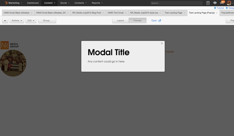
This example looks like this in the popover modal:
But you will obviously want to have something besides Modal Title in your popover. To add an image, you will simply insert an image tag like we did for the click-trigger.
That looks like this:
<div id="myModal" class="reveal-modal">
<img class="cuba_book_pages" src="http://cdn2.hubspot.net/hubfs/465210/0000-2.jpg" alt="Love is Our Mission" />
</a>
<a class="close-reveal-modal">×</a>
</div>
You will do that same thing we did for the click-trigger by switching out the image URL in orange for your image URL and changing the class and alt-tags for something relevant to your image.
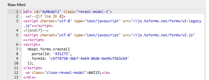
If you wanted to insert a form, you would replace the image tag that looks like <img class=..../> for the embed code for your HubSpot form.
Here is an example of what that would look like:
<div id="myModal" class="reveal-modal">
<!--[if lte IE 8]>
<script charset="utf-8" type="text/javascript" src="//js.hsforms.net/forms/v2-legacy.js"></script>
<![endif]-->
<script charset="utf-8" type="text/javascript" src="//js.hsforms.net/forms/v2.js"></script>
<script>
hbspt.forms.create({
portalId: '431273',
formId: 'c5f76758-36b7-4eb9-86db-6e49cf563cb9'
});
</script>
<a class="close-reveal-modal">×</a>
</div>
You will want to replace the orange code with the code for your own form.
To Create Multiple Modals
However, this is only the code for the first click-triggered modal. If you want more than one, we will have to make a few changes.
Changes to the Custom HTML Modules
In the above code, you probably noticed the data-reveal-id="MyModal". When creating more than one popover, we will need to rename this piece for every new modal. The easiest and cleanest way to do this would be to simply add a number to the end of MyModal. You will want to use a different number for each instance.
For example, when you look at the screen shot of my eight Custom HTML modules in my page template above, the modal set that is in the top left, named Image 1 and Modal 1, would use the "MyModal" ID. For the second image/modal set, I changed this ID to "MyModal1".
The code for Image 2 looks like:
<a href="#" data-reveal-id="myModal1">
<img class="cuba" src="http://cdn2.hubspot.net/hubfs/465210/Papal_Visit/Layer_5.png" alt="Love is Our Mission" />
</a>
The code for Modal 2 looks like this:
<div id="myModal1" class="reveal-modal-1">
<h1>Modal Title</h1>
<p>Any content could go in here.</p>
<a class="close-reveal-modal">×</a>
</div>
You want to make sure that you exactly replicate the ID for each corresponding image in its modal.
As you may have noticed, in the modal code we also have to change the class. For Modal 1 in my example, the code says class="reveal-modal". In Modal 2, the class has been changed to class="reveal-modal-1". This ensures that Modal 2 will popover when Image 2 is clicked.
Changes to the CSS
We also need to make a few changes to our CSS file. If you copy and pasted the CSS I provided you, that you have the option of adding up to four popover modals without having to change the code. However, in case you want to add more, here is how I did it.
The chunk of CSS for each modal looks like this. You will repeat this CSS one time for every image/modal set.
.reveal-modal-bg {
position: fixed;
height: 100%;
width: 100%;
background: #000;
background: rgba(0,0,0,.8);
z-index: 100;
display: none;
top: 0;
left: 0;
}
.reveal-modal {
visibility: hidden;
top: 100px;
left: 50%;
margin-left: -300px;
width: 520px;
background: #eee url(modal-gloss.png) no-repeat -200px -80px;
position: absolute;
z-index: 101;
padding: 30px 40px 34px;
-moz-border-radius: 5px;
-webkit-border-radius: 5px;
border-radius: 5px;
-moz-box-shadow: 0 0 10px rgba(0,0,0,.4);
-webkit-box-shadow: 0 0 10px rgba(0,0,0,.4);
-box-shadow: 0 0 10px rgba(0,0,0,.4);
}
.reveal-modal.large { width: 600px; margin-left: -340px;}
.reveal-modal.xlarge { width: 800px; margin-left: -440px;}
.reveal-modal .close-reveal-modal {
font-size: 22px;
line-height: .5;
position: absolute;
top: 8px;
right: 11px;
color: #aaa;
text-shadow: 0 -1px 1px rbga(0,0,0,.6);
font-weight: bold;
cursor: pointer;
}
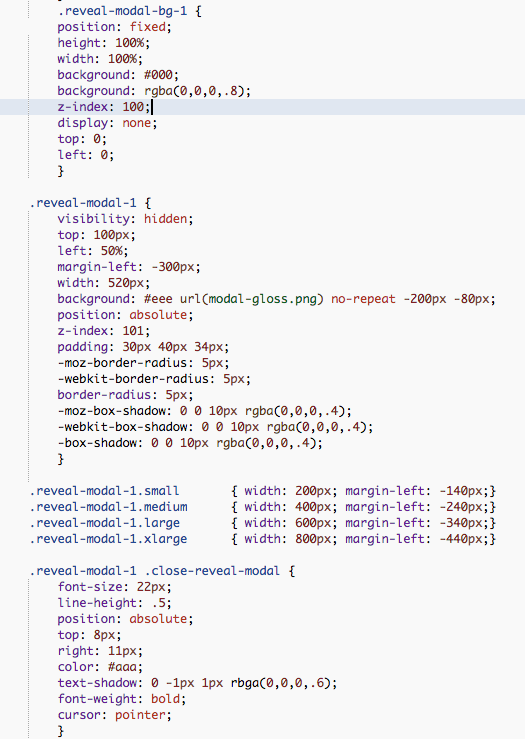
In order to add a modal, we need to copy and paste this chunk of code again, and change the reveal-modal to correspond with the class=reveal-modal that we assigned to our new popover modals.
So, each of the four modals that are included in my CSS file have a corresponding chunk of CSS that speaks directly to it.
The above CSS would be for Image 1 and Modal 1. The CSS below would be copy and pasted below Image 1's CSS and would belong to Image 2, and so on.
/*** Begin modal one***/
.reveal-modal-bg {position: fixed;
height: 100%;
width: 100%;
background: #000;
background: rgba(0,0,0,.8);
z-index: 100;
display: none;
top: 0;
left: 0; }
.reveal-modal {
visibility: hidden;
top: 100px;
left: 50%;
margin-left: -300px;
width: 520px;
background: #eee url(modal-gloss.png) no-repeat -200px -80px;
position: absolute;
z-index: 101;
padding: 30px 40px 34px;
-moz-border-radius: 5px;
-webkit-border-radius: 5px;
border-radius: 5px;
-moz-box-shadow: 0 0 10px rgba(0,0,0,.4);
-webkit-box-shadow: 0 0 10px rgba(0,0,0,.4);
-box-shadow: 0 0 10px rgba(0,0,0,.4);}
.reveal-modal.large { width: 600px; margin-left: -340px;}
.reveal-modal.xlarge { width: 800px; margin-left: -440px;}
.reveal-modal .close-reveal-modal {
font-size: 22px;
line-height: .5;
position: absolute;
top: 8px;
right: 11px;
color: #aaa;
text-shadow: 0 -1px 1px rbga(0,0,0,.6);
font-weight: bold;
cursor: pointer;}
/***Begin modal 2***/
.reveal-modal-bg-1 {
position: fixed;
height: 100%;
width: 100%;
background: #000;
background: rgba(0,0,0,.8);
z-index: 100;
display: none;
top: 0;
left: 0; }
.reveal-modal-1 {
visibility: hidden;
top: 100px;
left: 50%;
margin-left: -300px;
width: 520px;
background: #eee url(modal-gloss.png) no-repeat -200px -80px;
position: absolute;
z-index: 101;
padding: 30px 40px 34px;
-moz-border-radius: 5px;
-webkit-border-radius: 5px;
border-radius: 5px;
-moz-box-shadow: 0 0 10px rgba(0,0,0,.4);
-webkit-box-shadow: 0 0 10px rgba(0,0,0,.4);
-box-shadow: 0 0 10px rgba(0,0,0,.4);}
.reveal-modal-1.small { width: 200px; margin-left: -140px;}
.reveal-modal-1.medium { width: 400px; margin-left: -240px;}
.reveal-modal-1.large { width: 600px; margin-left: -340px;}
.reveal-modal-1.xlarge { width: 800px; margin-left: -440px;}
.reveal-modal-1 .close-reveal-modal {
font-size: 22px;
line-height: .5;
position: absolute;
top: 8px;
right: 11px;
color: #aaa;
text-shadow: 0 -1px 1px rbga(0,0,0,.6);
font-weight: bold;
cursor: pointer;}
Make sure during your copying and pasting you don't forget any brackets!
How everything looks together
Image 1 Custom HTML module code:

Modal 1 Custom HTML module code (this shows popover text):

Image/Modal 1 CSS:
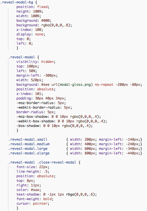
Image 2 Custom HTML module code:

Modal 2 Custom HTML module code (this one is a popover form):
And the corresponding Image/Modal 2 CSS:
You simply repeat this format and these naming conventions for your other two image/modal sets!
Let me know in the comments how this format works for you and if you have any questions!
Happy coding!

